Volume Trading Analysis for NVIDIA stock
Analyzing stock trading volumes and price movements using Python
This project implements a simple analysis of stock trading volumes and price movements using Python. The analysis focuses on identifying significant volume spikes that could indicate important market events or trading patterns. This post is inspired from GuruFinance Insighs
Key Features
- Historical stock data retrieval using yfinance
- Volume analysis with moving averages
- Dynamic threshold detection for unusual trading volumes
- Interactive visualizations of price movements and volume patterns
Implementation Details
The implementation uses several Python libraries including pandas for data manipulation, yfinance for stock data retrieval, and matplotlib for visualization. Here’s how it works:
- Some code details
import pandas as pd
import matplotlib.pyplot as plt
import yfinance as yf

# Update font sizes globally
plt.rcParams.update({
    'font.size': 22,          # Base font size
    'axes.titlesize': 22,     # Title font size
    'axes.labelsize': 22,     # Axis label font size
    'xtick.labelsize': 22,    # X-axis tick label font size
    'ytick.labelsize': 22,    # Y-axis tick label font size
    'legend.fontsize': 22     # Legend font size
})

percentile_level = 0.97
- First, we retrieve historical stock data
stock_symbol = "NVDA"
stock_data = yf.download(stock_symbol, start='2020-01-01', end='2025-01-17')
- We calculate moving averages for both price and volume:
stock_data['Short_Term_MA'] = stock_data['Close'].rolling(window=50).mean()
stock_data['Long_Term_MA'] = stock_data['Close'].rolling(window=200).mean()
stock_data['Avg_Volume_20'] = stock_data['Volume'].rolling(window=20).mean()
- A volume index is created to identify unusual trading activity:
stock_data['Volume_Index'] = stock_data['Volume'] / stock_data['Avg_Volume_20']
- Dynamic threshold
dynamic_threshold = stock_data['Volume_Index'].quantile(percentile_level)
highlight_mask = stock_data['Volume_Index'] > dynamic_threshold
Price Evolution and Volume Analysis
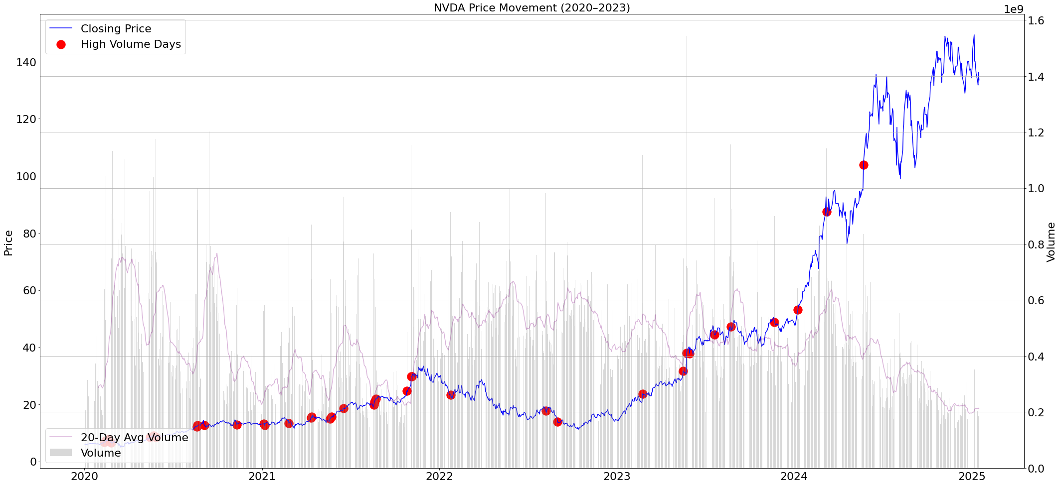
The primary chart combines price movement with volume analysis, creating a comprehensive view of market activity. The blue line traces the stock’s price journey, while the underlying gray bars represent daily trading volumes. Red dots mark days where trading volume significantly exceeds normal levels (above the 97th percentile), potentially signaling major market events, institutional trading, or significant news impacts. The purple line showing the 20-day average volume provides context for what constitutes “normal” trading activity. This combination of indicators helps identify whether price movements are supported by strong trading volume, which can validate the significance of price trends.

The visualization combines price movements with volume analysis, highlighting days where trading volume exceeds the 97th percentile of the volume index. This helps identify potentially significant market events or unusual trading activity.
Volume Ratio Dynamics

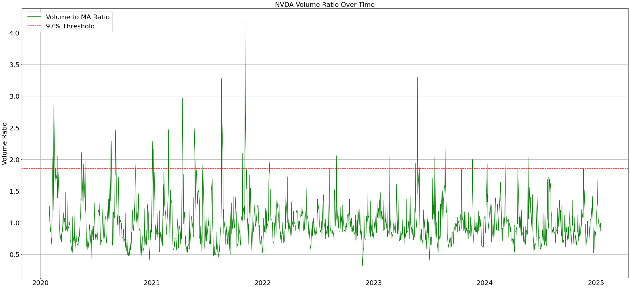
The volume ratio plot offers a normalized view of trading activity, making it easier to identify unusual volume patterns regardless of the absolute price level. The green line represents the ratio between daily volume and its 20-day moving average, effectively highlighting periods of exceptional trading activity. When the ratio exceeds the red dashed threshold line (set at the 97th percentile), it signals potentially significant market events. This visualization is particularly valuable for identifying periods of institutional activity or major market sentiment shifts, as abnormal volume often precedes or coincides with significant price movements.
Statistical Distribution of Volume

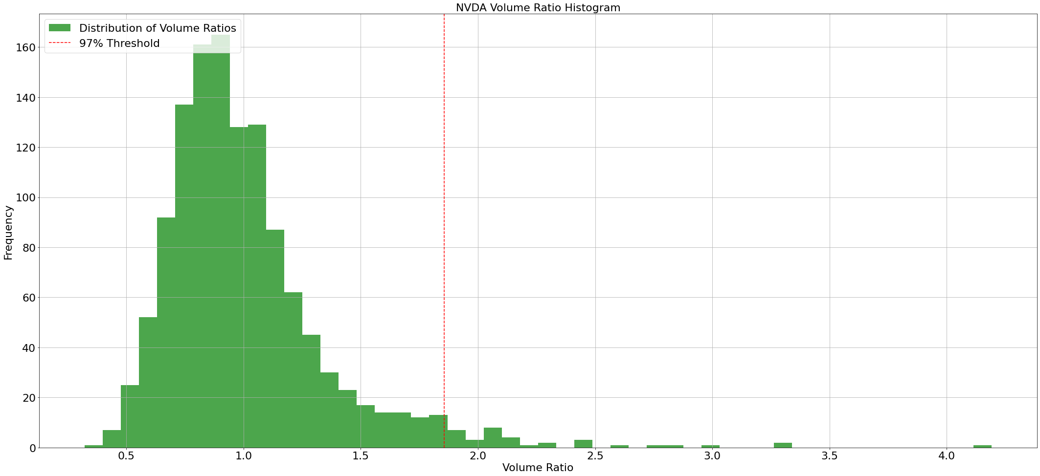
The histogram provides a statistical perspective on trading volumes, showing how frequently different volume ratios occur. The bell-shaped distribution typically indicates that most trading days experience normal volume levels, clustering around the ratio of 1.0. Days that fall beyond the red dashed threshold line are statistically significant outliers, representing less than 3% of trading days. These outlier days often coincide with major market events, earnings announcements, or significant news that could impact the stock’s future trajectory. Understanding this distribution helps analysts calibrate their expectations for what constitutes truly unusual trading activity.
The analysis uses several sophisticated techniques:
- Dynamic Thresholding: Instead of using fixed thresholds, the system calculates a dynamic threshold based on the 97th percentile of volume ratios.
- Statistical Analysis: Volume patterns are analyzed using rolling averages and ratio calculations.
Here is the full python code:
import pandas as pd
import matplotlib.pyplot as plt
import yfinance as yf

# Update font sizes globally
plt.rcParams.update({
    'font.size': 22,          # Base font size
    'axes.titlesize': 22,     # Title font size
    'axes.labelsize': 22,     # Axis label font size
    'xtick.labelsize': 22,    # X-axis tick label font size
    'ytick.labelsize': 22,    # Y-axis tick label font size
    'legend.fontsize': 22     # Legend font size
})

# Set parameters
stock_symbol = "NVDA"
percentile_level = 0.97

# Retrieve data
stock_data = yf.download(stock_symbol, start='2020-01-01', end='2025-01-17')

# Calculate moving averages
stock_data['Short_Term_MA'] = stock_data['Close'].rolling(window=50).mean()
stock_data['Long_Term_MA'] = stock_data['Close'].rolling(window=200).mean()
stock_data['Avg_Volume_20'] = stock_data['Volume'].rolling(window=20).mean()

# Calculate volume index
stock_data['Volume_Index'] = stock_data['Volume'] / stock_data['Avg_Volume_20']

# Calculate dynamic threshold and create mask for high volume days
dynamic_threshold = stock_data['Volume_Index'].quantile(percentile_level)
highlight_mask = stock_data['Volume_Index'] > dynamic_threshold

# Create Figure 1: Price and Volume Plot
fig, price_ax = plt.subplots(1, figsize=(30, 14))

# Plot closing price
price_ax.plot(stock_data.index, stock_data['Close'], label='Closing Price', color='blue')
price_ax.scatter(stock_data.index[highlight_mask],
                stock_data['Close'][highlight_mask],
                color='red',
                s=300,
                label='High Volume Days')
price_ax.set_title(f'{stock_symbol} Price Movement (2020–2023)')
price_ax.set_ylabel('Price')
price_ax.legend(loc='upper left')

# Add secondary axis for volume
volume_ax2 = price_ax.twinx()
volume_ax2.bar(stock_data.index, stock_data['Volume'], color='gray', alpha=0.3, label='Volume')
volume_ax2.plot(stock_data.index, stock_data['Avg_Volume_20'],
                color='purple',
                label='20-Day Avg Volume',
                alpha=0.3)
volume_ax2.set_ylabel('Volume')
volume_ax2.legend(loc='lower left')

plt.tight_layout()
plt.grid(True)
plt.show()

# Create Figure 2: Volume Ratio Plot
fig, volume_ax = plt.subplots(1, figsize=(30, 14))

# Plot volume ratio
volume_ax.plot(stock_data.index, stock_data['Volume_Index'],
               label='Volume to MA Ratio',
               color='green')
volume_ax.axhline(y=dynamic_threshold,
                  color='red',
                  linestyle='--',
                  label=f'{percentile_level*100:.0f}% Threshold')
volume_ax.set_title(f'{stock_symbol} Volume Ratio Over Time')
volume_ax.set_ylabel('Volume Ratio')
volume_ax.legend(loc='upper left')

plt.tight_layout()
plt.grid(True)
plt.show()

# Create Figure 3: Volume Distribution Histogram
fig, hist_ax = plt.subplots(1, figsize=(30, 14))

# Plot histogram
hist_ax.hist(stock_data['Volume_Index'],
             bins=50,
             color='green',
             alpha=0.7,
             label='Distribution of Volume Ratios')
hist_ax.axvline(x=dynamic_threshold,
                color='red',
                linestyle='--',
                label=f'{percentile_level*100:.0f}% Threshold')
hist_ax.set_title(f'{stock_symbol} Volume Ratio Histogram')
hist_ax.set_xlabel('Volume Ratio')
hist_ax.set_ylabel('Frequency')
hist_ax.legend(loc='upper left')

plt.tight_layout()
plt.grid(True)
plt.show()